Fuse, digital wallet.
A personal finance app powered by the same smart accounts that secure billions on Solana.
Earlier last year, I had the chance to explore a redesign concept with the founders of Fuse (Squads Protocol).
It's the leading digital wallet on Solana, securing close to $10B today.
The goals was to redesign the mobile experience, improving visual hierarchy and interaction patterns for 350+ teams and thousands of users.

Leading Solana Wallet
Deni, the founder, reached out to me directly on X:
We love what you've done with MUM Studio.
What’s the best way to redesign Fuse so it feels safer, more premium, and has its own identity
Before opening Figma, I spent time understanding the landscape.
So first, I had a look at the competition
I analyzed the leading wallets and crypto platforms: Trust Wallet, Coinbase, Crypto.com, Phantom, MoonPay, Rainbow etc...
The first thing that struck me: they all look the same.
Blue gradients, rounded cards, the same safe sans-serif. Swap the logos and you'd struggle to tell them apart.
Worse, for most they feel like SaaS dashboards: functional, forgettable, designed by committee. Enterprise software wearing a crypto skin.
That gap was the opportunity: design a wallet with a different identity, that people trust, not one that looks and behave like everything else.

Trust Wallet

Coinbase

MoonPay

Crypto.com

Family
Trust Wallet
Coinbase
MoonPay
Crypto.com
Family
Mapping where competitors stand on user experience vs features helped identify opportunities and depth.
After that I was ready to audit the existing experience
I walked through Fuse as a user would, documenting friction points following 3 pillars that I believe are crucial for a smart wallet:
Hierarchy
Find what matters, and find it fast.
Trust
Assets should feel unquestionably secure
Interaction
Every action deserves clear feedback
Hover dots to reveal audit • Use arrows to navigate frames
1. Onboarding
I redesigned the onboarding flow to be more intuitive and trustworthy, guiding users through setup with clear steps and security reassurance.
I mapped the existing flow and found 3 drop-off risks:
Promise first
Users want to know what's in it for them
Permission context
Every request explains the benefit clearly
Familiar recovery
Email verification over seed phrases
Fewer screens, clearer purpose. Each step earns the next.
Crypto onboarding is where wallets lose users. Seed phrases, gas fees, network selection. A wall of jargon that makes people feel like they're about to make an expensive mistake.
I restructured onboarding around a simple principle:
Earn trust before asking for commitment.
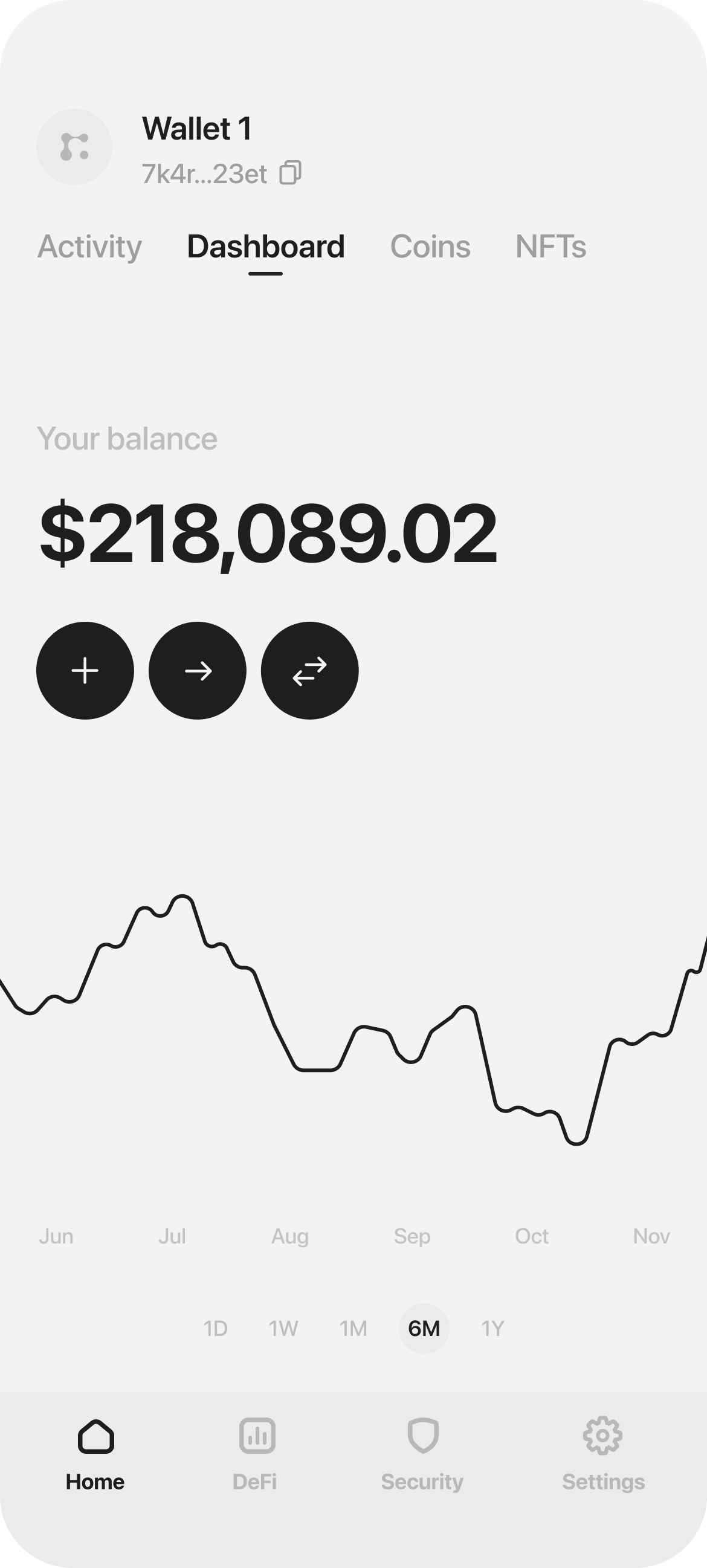
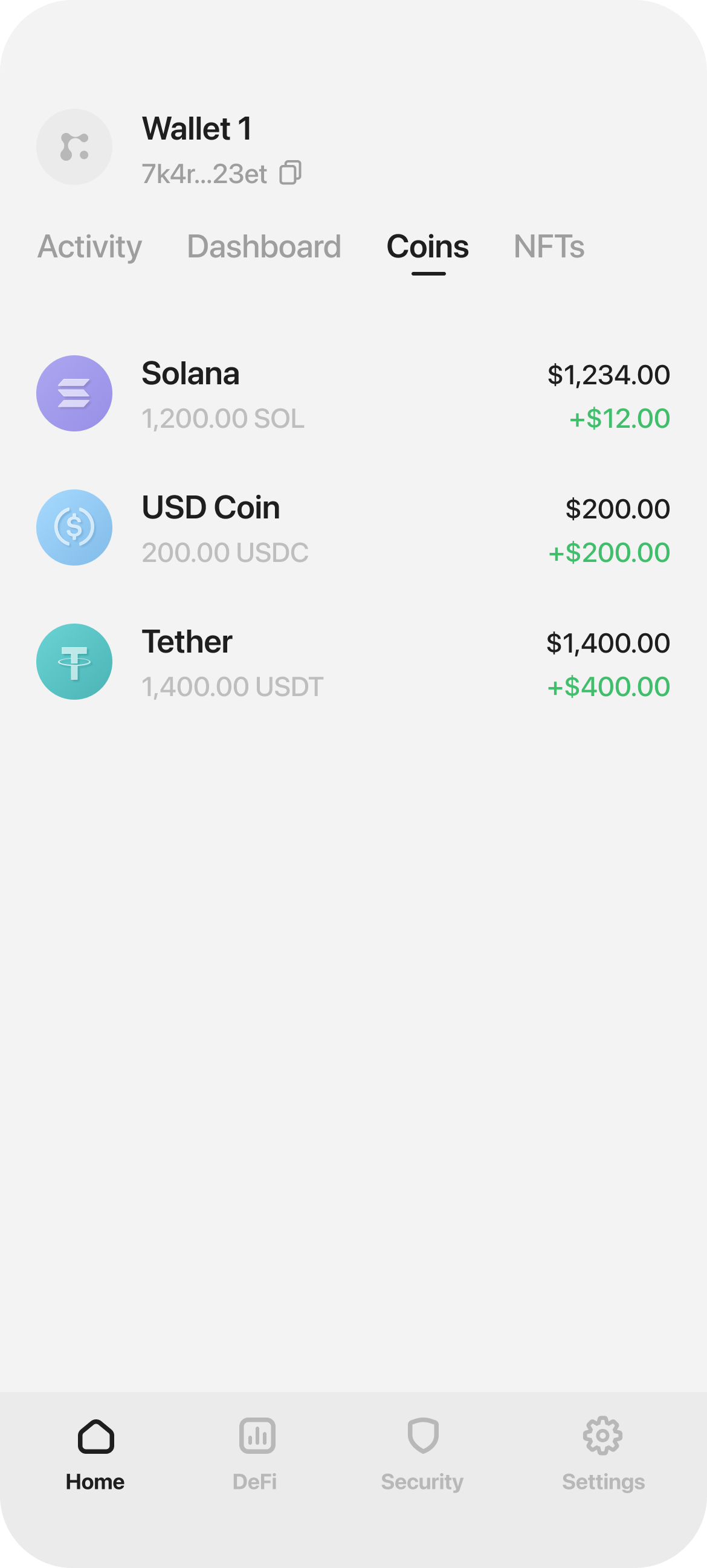
2. Dashboard
The dashboard is where users spend most of their time, so clarity is everything. Users should be able to see their balance at a glance, instantly.
Most wallets bury this under charts, token lists, and banners, forcing users to hunt for what matters.
A clean, decluttered dashboard with a clear balance breakdown and visible growth over time puts users in control: fast, effortless, and focused on what counts.
Clear balance
Total value front and center, no clutter
Smart grouping
Assets organized by type, no endless lists
Smart portfolio
All wallet insights, accessible in one tap.
Wallet Selection
Hover to playSmart wallet selection, allowing quick overview
I redesigned the layout to prioritize clarity: large balance display at the top, quick actions within thumb reach, and token list sorted by portfolio weight.
The result feels less like a finance dashboard and more like a home screen you actually want to check.
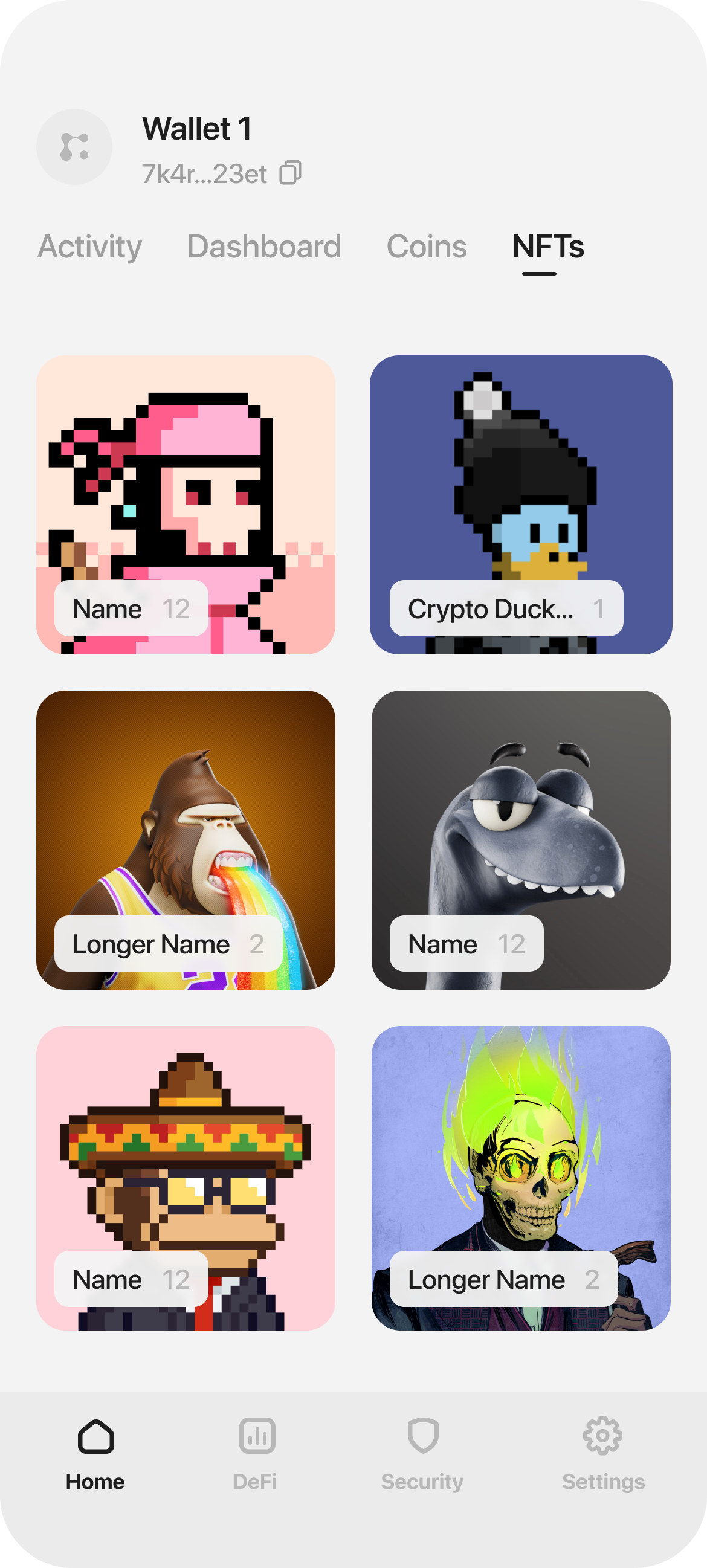
3. NFT Collection
NFT galleries in wallets are often cluttered walls of thumbnails. No hierarchy, no breathing room, just a grid that makes everything feel equally unimportant.
The challenge: design a browsing experience that feels more like a curated collection than a file explorer.
Browsing exp.
Smart motion makes navigation effortless
Smart insights
Live updates and balances at a glance
It's a Museum
Clean interface that highlights what matters


NFT Collection
Drag slider to compareNFT markets move fast. A collection spikes, a floor price drops, a mint goes live. Users miss opportunities because they're not watching feeds constantly.
I designed a contextual news toaster that surfaces relevant updates without interrupting the experience. It appears when market activity matters to your holdings, then dismisses cleanly.
The information is actionable: price movements, collection trends, wallet activity. Just enough context to make an informed decision, delivered at the right moment.
News
Hover to playProvides live insight, helping buy/sell decisions
I redesigned the NFT view to prioritize the art: one piece at a time, full-screen, with details accessible but not intrusive.
The interaction is simple: swipe to browse, tap to expand. No extra steps, no modal friction. Your collection becomes something you want to explore, not manage.
NFT Collection
Hover to playOne-tap browsing experience, reducing friction
4. Navigation
Most wallets fail to explain actions clearly, relying on generic icon-only CTAs. Users don’t understand what will happen until they click, which creates a poor UX experience.
I designed an action wheel with clearly labeled CTAs alongside icons.
This ensures users understand each action instantly, avoiding the confusion caused by generic icon-only buttons.
Actions wheel
Hover to playLabeled actions replace ambiguous icons, reducing cognitive load
Assets switch
Hover to playAction wheel provides intuitive navigation between asset types